


Two Birds Brewery
Brand Strategy, Logo Design, Brand Identity, Packaging Design
Maria and Jake, married and business partners, were always fans of beer. A few years ago, they started brewing their own beer and decided to open a small brewery called Two Birds (‘their’ nickname as they are always seen together and cute having fun around).
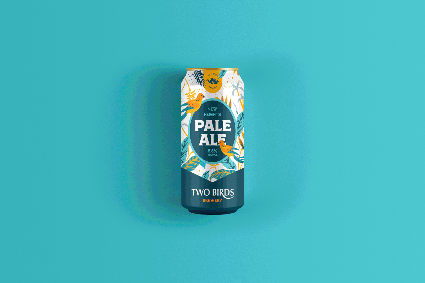
Since then, they expanded so much, with a variety of beers, so they had to hire 2 additional employees and work on their brand image. Approached with love and passion, their brews are still handcrafted with the highest quality ingredients. Inspired by the Arizona landscapes, nature and vibes, Two Birds recently placed out 3 flavours - Birds of Paradise IPA, New Heights Pale Ale and Flying Freedom ALE. Each flavour is represented by a unique colour palette that resembles the notes while drinking the beer.
The Mission & Challenges
Our mission was to properly position them amongst the competitors, so they can stand out with the appropriate design. We had to figure out how to turn their logo and packaging, which was just a basic textual label, into something consistent and memorable so that it reflects their high quality and passion for beers. The brewery name is awesome, but nowhere in the design has it been shown, which was an oversight because it can be used so beautifully through the packaging.

The Output
After we evaluated Two Birds’s positioning and core values, we ended up with an illustrative combination for the logo and packaging. Besides the logo and beer packaging, we also did business cards, menu, brochures, messaging/taglines and their website as well. The overall image that we ended up with is playful, catchy, but still high class and attractive for all generations, as it attracts them to comment on what is going on there on these colorful labels and illustrations.
For the logo, we crafted two cute birds next to each other, combined with the uniquely modified wordmark. We opted for the dark blue and teal blue color scheme, accompanied by oranges, reds and greens for various beer flavours. Bold typography is used to highlight the beer type/name and alcohol percentage.
The Impact
After launching a successful rebrand, their metrics for the last 6 months have shown an average of 28% increase in sales! They also managed to get their beer on some shelves at the markets around them. Not only that, but their website is getting a lot of visitors, as we suggested they maintain a quality blog and weekly offers/package for their beers. Currently, we are considering implementing a web shop to boost the sales and brand awareness even more. And! they are figuring out a sub-brand of their own which will be a beer-related podcast, in collaboration with other breweries.


Client Testimonial
Our biggest concern was how to represent ourselves, since we didn't know anything about the design and importance of it. Throughout the whole process, we learned so much working with Ivan and his team, and now we appreciate and understand our (and others!) design much more. They delivered an amazing logo and set of visuals which we are using throughout the packaging and other digital assets. After the rebrand, we immediately felt the impact, which can be seen in our sales that grew over 30% for the last 6 months, amazing! Also appreciating the ideas for the beer podcast and will definitely hire Insigniada for the web shop and other upcoming stuff! :)
Maria & Jake, Owners at Two Birds Brewery
Thank you for watching!
Are you ready to make your brand awesome?
Are you ready to make your brand awesome?
If you are interested in a cooperation with us, drop us an email and we'll get to you as soon as possible.
www.insigniada.com | hello@insigniada.com
Skype: Insigniada | © 2021 Insigniada
www.insigniada.com | hello@insigniada.com
Skype: Insigniada | © 2021 Insigniada


